
Table of Contents
Determine Rate And Direction Of Frontal Movements
Locate Potential For Sea Breeze Along Shorelines
Locate Potential For Sea Breeze Along Shorelines
Determine Realtime Wind Speed And Direction To Supplement Buoy Data
Determine The Characteristics Of Pressure Systems And Fronts
Introduction
Reading a satellite image is somewhat akin to reading a medical X-ray. With practice and some experience, it can be a wonderful diagnostic tool, especially when used in conjunction with other reliable sources of information.
Below, we will help you gather and analyze weather data using the following satellite imagery:
Infrared (IR)
Infrared (IR) satellite imagery measures temperature. IR satellite imagery (also called thermal imagery) is produced by both high-orbiting geostationary satellites (GOES) as well as low-orbiting satellites (polar orbiters). Since they are geostationary, GOES satellites do not move relative to the earth’s surface; they transmit continuous images of the same portion of earth. Polar orbiters are closer to earth and can ultimately get a finer resolution than a high altitude GOES image.
- High altitude: A wide variety of high altitude GEOS
satellite images can be viewed at: http://weather.msfc.nasa.gov/GOES/
- Low altitude: Low-earth orbiting information can be reviewed at: http://www.oso.noaa.gov/poes/. POES stands for Polar Operational Environmental Satellite. This site includes a Polar Orbiter Data User’s Guide.
For the North Atlantic, visit the Johns Hopkins Applied Physics Lab website
at: http://fermi.jhuapl.edu/
and explore the AVHRR data, and their other resources.
In most cases, sailors at sea will access polar orbiter data using satellite picture receivers aboard their vessels. WeatherTrac, Sea Station 2000 and others allow for automatic reception of automatically transmitted images.
Thermal images (high altitude and low altitude) are representations of the relative temperature of clouds, sea surface and land. The images taken by the satellites can be enhanced by meteorologists to provide clearer visual discrimination between the temperature differences.
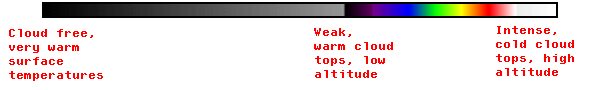
The most popular method of enhancement is to color code the various temperature bands. For example, the color index below belongs to the accompanying IR satellite image. Note that the coldest clouds are white, red, orange, yellow and green (in order of increasing temperature). As the temperatures continue to warm, the colors go from green to blue to light grey to dark gray or black. Be careful during the analysis: some of the gray over the ocean may actually be low-level cloud or fog and, during winter months, some of the green or blue may actually be snow on the ground. To make sure that what you are viewing is cloud or fog, look at Visible Light satellite images from the same time frame (described further below). On the IR image, the warmer, lower level cloud or fog will appear to be a darker shade of gray than the higher, colder clouds. But on the Visible Light images all of the clouds will look white from above, regardless of whether they are high-level (cold) or lower-level (warm) cloud or fog.
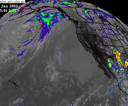
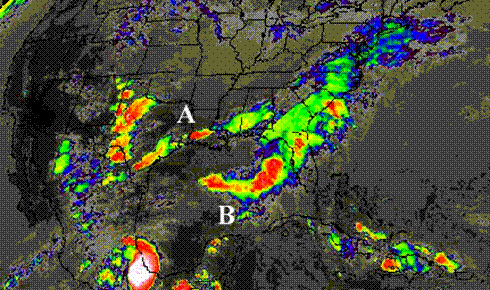
You can practice reading satellite images by comparing them against different data sources, especially weather maps. For example, look at the cold front indicated on the surface analysis below and compare that to the cloud line on the IR image. You can see that the cold front extends down to Hawaii in both cases. But by looking at the IR satellite image, you can tell that the southernmost part of the front has lower, warmer clouds that start to dissipate as they get north of Hawaii. The winds are less likely to be as gusty in the front. The barometric pressure on each side of the front north of Hawaii is also an indicator that winds are light preceding and following the front (i.e., the isobars are widely spaced).
Additionally, the IR satellite image shows that the cloud cover near the center is lower and warmer, with fewer violent storm cells characteristic of an occluding low. We know that “occluding lows” are lows that have started to age and decay, with less wind near the center and more wind around the edges. In these older lows, the associated cold front tends to begin overrunning the warm front in some part of the system. This is certainly indicated in the IR satellite image.
|
|
|
EXAMPLE:
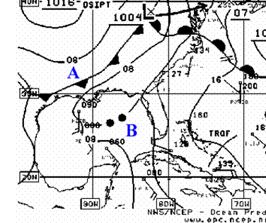
Compare the two images:
1. On the Surface Analysis Chart, locate the cold front (marked "A"). Notice that on the corresponding IR satellite image the front is indicated by the band of clouds and that some are very tall clouds (in red).
2. On the Surface Analysis Chart, locate the squall line (marked “B” – two black dots with lines on either side). Notice that on the IR satellite map, this feature is VERY prominent and potentially very dangerous. Without the IR satellite map, you would not be able to appreciate the potential energy along the squall line, nor the high strength of the squall compared to the relatively lower strength and smaller area of the cold front.
3. Note the difficulty spotting the warm front on the IR image. On the western part of the warm front there are lower and therefore warmer clouds (blue and green). There may be a great deal of rain associated that part of the warm front, but there is probably relatively little gusting wind.
|
|
ACTION |
EXPLANATION |
DETERMINE RATE AND DIRECTION OF FRONTAL MOVEMENTS
1.
Collect
a series of IR images, or view looping (animated) IR images. 2. From the movement of the front over the time difference between images, calculate direction and rate of travel of the front. To understand how the different parts of the front are moving, you may want to compare the relative positions of the two “ends” of the front as well as the mid point.
|
Animation can help you to understand the existing trend in speed and heading for the front or other weather features. While trends can change, a trend generally may be expected to continue in the near term, for the next few hours. If you’re sailing in the afternoon, it can be a huge help to look at the speed, heading and type of cloud cover in the systems that are approaching your own position. The trend may not continue, but it’s a good place to start making some rough assumptions from which to modify your expectations.
Here is an example of IR images we collected and animated
Many sites provide looped satellite images. For examples, see:
http://weather.msfc.nasa.gov/GOES/
NOTE: Images from orbital satellites are not useful for animations because orbital satellites are moving all the time, and it's difficult to get a constant perspective. GOES, on the other hand, are geostationary and provide better images for animation purposes.
|
|
ACTION |
EXPLANATION |
|
LOCATE POTENTIAL FOR SEA BREEZE ALONG SHORELINES
|
You can use low earth orbiting IR images or high altitude geostationary satellite (G0ES) imagery zoomed in to locate the shoreline and determine if there are small, relatively low-lying fair weather cumulus clouds lined up along the coast.
If the clouds line up along the coast and the inland temperatures are significantly warmer than the sea temperatures offshore, the conditions are most likely contributing to the development of a sea breeze.
This is an example of how high altitude GOES IR images zoomed in (to 1 km resolution) can show the development of a sea breeze. The images show the formation of clouds along the coastline as the land heats up throughout the day. These warmer, lower altitude clouds are shown as shades of gray.
IR images also show how the clouds change as the land heats up: the clouds along the coasts begin to grow in response to the increase in temperature of the land. The images in the animation were taken from 1130 to 1600 (local times). The animation shows the land becoming a darker shade of gray as the day progresses. According to the color scheme (the darker the gray, the warmer the surface), the images show that the land is getting significantly warmer as the time approaches midday. Also notice the clouds beginning to form along the southern part of the eastern coast of Baja California (lower right hand corner). They are low lying clouds, relatively small fair weather cumulus clouds, which we can tell by the fact that they are not bright white – the color of higher, colder clouds. As the day progresses toward early afternoon, the land cools down, and the cloud formation along the coastlines diminish.
|
|
IDENTIFY SEA SURFACE FEATURES
|
Both low earth orbiting satellites and GOES satellites can be very effective for picking out particular sea surface features such as warm or cold currents. They are usually identified as “SST” images (Sea Surface Temperature), “SSH” (Sea Surface Heights) or “SHA” (Sea Height Anomalies).
For an example, see:
http://www7300.nrlssc.navy.mil/global_nlom/globalnlom/skill.html
· Select “Gulf Stream Region” · Scroll down to “SST Nowcast” · Select “Last 12 month loop”
. |
Visible light
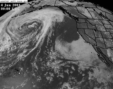
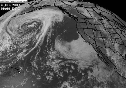
Visible light images rely on the sun’s light to show us the weather conditions, and tell us a different story than IR images do. Comparing visible light and IR images can be very revealing for weather analysis.
Look at the two Visible Light images below (from http://weather.msfc.nasa.gov/GOES/) taken about the same time for the same area. The cloud cover west of California and Baja California appears to be somewhat similar to other clouds. However, when we look at the IR image of the Pacific (above) we see that the cloud mass is quite warm – almost the temperature of the ocean. We realize that it is probably very low-lying cloud or fog. It is NOT indicating a front or storm cells in which there could be a great deal of wind. Fronts and storm cells would be associated with higher, colder clouds.
On Visible Light images, clouds will all show up as white. On IR images, they will have varying shades depending on their temperature and the heights of the cloud tops. Often the taller and colder the cloud, the more wind there is underneath it, if it is a convective type of cloud. If you’re passing under a front that has many tall/cold clouds associated with it, you can expect local gusting at the surface and should prepare accordingly.
Ocean currents, of course, will not show up on a Visible Light image. However, on an IR image currents can appear lighter for the colder water and darker for the warmer water. The lighter patch of ocean south of Hawaii in the Visible Light image below is actually the reflection of the sun as the time approaches midday near Hawaii. Temperatures are not indicated on Visible Light images.
|
|
|

|
ACTION |
EXPLANATION |
|
IDENTIFY MOVEMENT OF FRONTS
|
You can use visible light images to track the movement of fronts. The clouds will all appear the same, but animation will show you which way they are moving. You might find it difficult to pick out the actual front, but keep in mind that a front is the boundary between dissimilar air masses. Often cold air is coming down from the north or northwest, meeting warmer air coming up from the southwest or south. The cloud line along that interface may lie along the front, or it may be a squall line that precedes the front. Comparing an actual surface analysis valid for the same time as the animated satellite images will help you learn to locate various weather features.
This example shows the movement of a front over the Pacific.
|
|
|
|

|
ACTION |
EXPLANATION |
|
IDENTIFY FOG
1. Display both IR and visible light images for the same VALID TIME and area on the computer. 2. Toggle between the two images.
|
The temperature of fog can be close to the sea temperature. The IR image has some difficulty differentiating between the actual sea and a fog bank.
The visible light picture will show the fog bank as a white mass, similar to the way it depicts higher altitude clouds. When you toggle between the two images, it becomes obvious which parts of the image represent high altitude clouds, lower level clouds and fog. |
|
ACTION |
EXPLANATION |
|
LOCATE POTENTIAL FOR SEA BREEZE ALONG SHORELINES
|
Visible light images can also help detect a sea breeze. The visible light will show the clouds better than the IR images, because white clouds contrast against a gray background better than the gray clouds shown on an IR image.
Example:
Compare this sequence with the IR sequence above.
Notice the tiny white clouds located along the eastern shore of the lower part of Baja California at the right of the screen. Also notice the cloud formation on mainland Mexico located further up the screen. The clouds are showing us that the air is unstable. Air is rising, and moisture is condensing. The thin cloud line along the eastern coast of Baja California suggests that air is very likely being pulled in at the surface as a sea breeze to replace the rising air over the land.
NOTE: Visible light images are not as effective as the IR images at showing how the land heats up throughout the day. This is because the visible light shows all clouds – cold high altitude and lower, warmer clouds – as white. IR images, on the other hand, show a change in the shade of gray of these clouds as the land heats up.
|
Scatterometer (QuikSCAT)
Scatterometer data is a relatively new form of satellite information available to the general public. Microwave beams are sent from a satellite to the earth’s surface below, which reflects them back to the satellite. From the resulting data, wind speed can be determined and, by analyzing a series of images over time, wind direction can also be deduced. For more information on QuikSCAT data, see the Scatterometer tool.
This technology is producing very accurate results, and compares favorably in accuracy to buoy data. Keep in mind that the data is an average of the conditions; therefore, it will more accurately depict gradient wind patterns than local and temporary conditions.
|
ACTION |
EXPLANATION |
|
DETERMINE REALTIME WIND SPEED AND DIRECTION TO SUPPLEMENT BUOY DATA
|
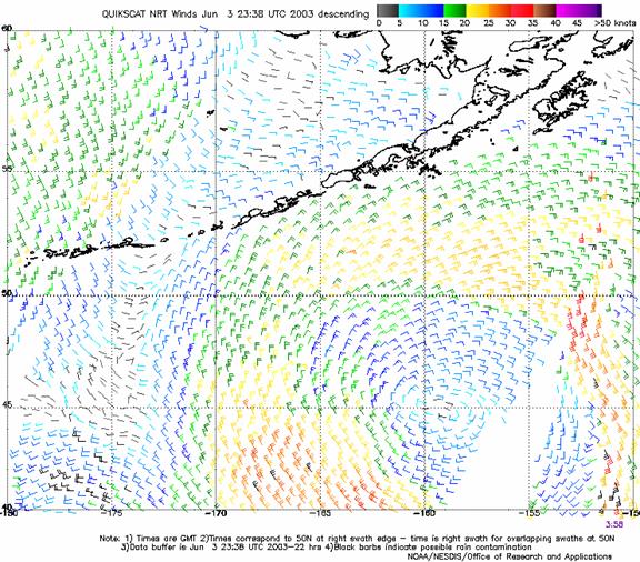
Since scatterometer data is available in near real-time on the web, it can be used to look at real-time wind conditions in remote locations offshore, or in other places that may not have buoys.
Compare the QuikSCAT image with the other satellite images. The QuikSCAT image gives you a much clearer idea of the wind field around the occluding low-pressure system.
(The white gap in the data is a result of a gap in the satellite orbital coverage, and does not indicate any meteorological information.)
|
|
DETERMINE THE CHARACTERISTICS OF PRESSURE SYSTEMS AND FRONTS
|
Scatterometer data can supplement synoptic scale analysis when determining the location and movement of pressure systems and fronts.
Compare scatterometer data with surface analysis maps for the same VALID TIMES. With the addition of the scatterometer data, you will have a clearer idea of wind speed and direction.
NOTE: When you collect scatterometer data, also look at several buoys in the area to confirm the accuracy of the scatterometer data. Scatterometer data is subject to reliability issues inherent with all remote sensing technologies. |
©2010 L. Roberts and B. Biewenga
(203) 389-4440
Last Modified: April 14, 2010